You read about taking photos that are not usual and “surreal”. You have seen “amazing” colors like the one posted in Figure 1. Then, you may want to consider having the 550nm filter and learn how to use it.
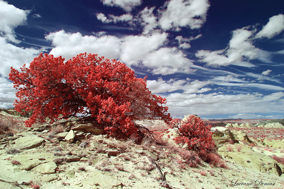
Figure 1: example of what you can do with the 550nm filter
The first question that you may have is the following: where do I get a 550nm filter? An option would be to go to Kolari Vision’s website (https://kolarivision.com/product/kolari-vision-infrared-filter/) or you can also search other valuable options such as the YA3 PRO (ORANGE) filter (https://hoyafilter.com/product/ya3_pro_orange/). I have bought the Kolari Vision’s 550nm filter which I use on the lenses of a modified camera by Lifepixel (www.lifepixel.com). Sounds too complicated? It is not. Just contact Lifepixel or Kolari Vision (or other companies you trust) to understand how the camera is modified in the practice to get into infrared photography. Maybe you have an old digital camera collecting dust and you want to have a good use of it…You do not have to worry about the process. To simplify the concept, the modification allows the camera to “see” light beyond the visible spectrum. In the case of 550nm filter the light that actually hits the sensor is approximately at a wave length of 550nm and beyond that level. Just to give a comparison, the visible light has a variability of wave lengths between 400nm and 700nm. For instance, the violet color corresponds to wave lengths in the range of 390nm-455nm and the yellow is between 577nm and 597nm.
Yes, the 550nm filter is a little “complicated” to begin exploring the infrared world, but has a lot of surprises and if you are not discouraged and follow these instructions, you will not regret it.
The secret in all the infrared photography, no matter of which filter you use, is to take a photo of a scene which contains some vegetation and at the same time water, houses etc. You will be very surprised by the outcome. That is why I never get bored!
It is mandatory for excellent results (and to keep the frustration out) to use RAW format (not the JPG!) as output from your camera, so you will have more freedom in postprocessing.
Do not invest your energy on how to do the white balance within the camera, looking at various settings etc. It is pointless and absolutely a waste of time in the world of infrared photography. Just pick any custom or automatic white balance setting from your camera and do not care about the appearance you see from the screen. The photo will appear absolutely horrible. It is expected, the infrared photography journey is just beginning and the result will be judged at the end of the patient process!
An example of a typical photo you get from converting to JPG an unprocessed RAW image is reported in Figure 2.
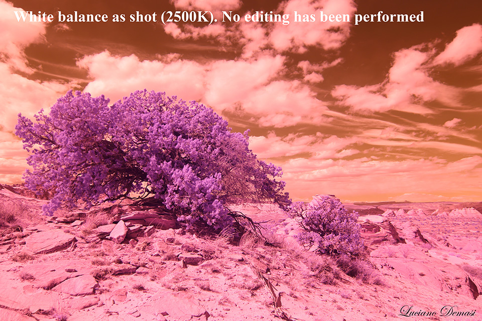
Figure 2
This picture is a disaster and useless. However, even it is not obvious at this stage, you can get the photo of Figure 1 with some simple operations (I wish I had a similar guide when I was learning infrared photography…I would have saved months of failures).
Take your camera software (no third party software, this is very important!) and adjust the white balance on the RAW file (not on the exported JPG file!). After you adjusted the white balance, the exported JPG photo from the modified RAW file will look like the one posted here in Figure 3 (observe the differences between Figure 3, reporting the correct white balance, and Figure 2 which did not have the correct setting).
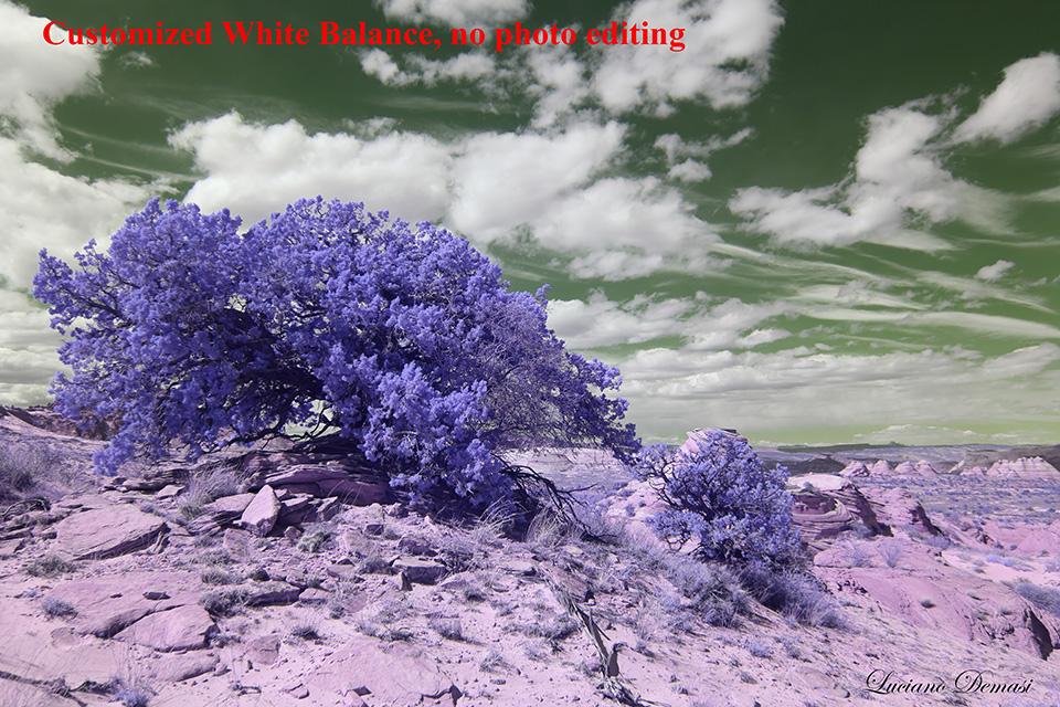
Figure 3
And you are done!
The photo is nice, but not so colorful like Figure 1. Also the sky is not blue. We will now proceed with the Red-Blue channel swap. Take the image with the customized (“correct”) white balance (Figure 3) and in PHOTOSHOP select “Image-Adjustments-Channel Mixer”. Select the “Output Channel” to be “Red” (see Figure 4). Do not press OK.
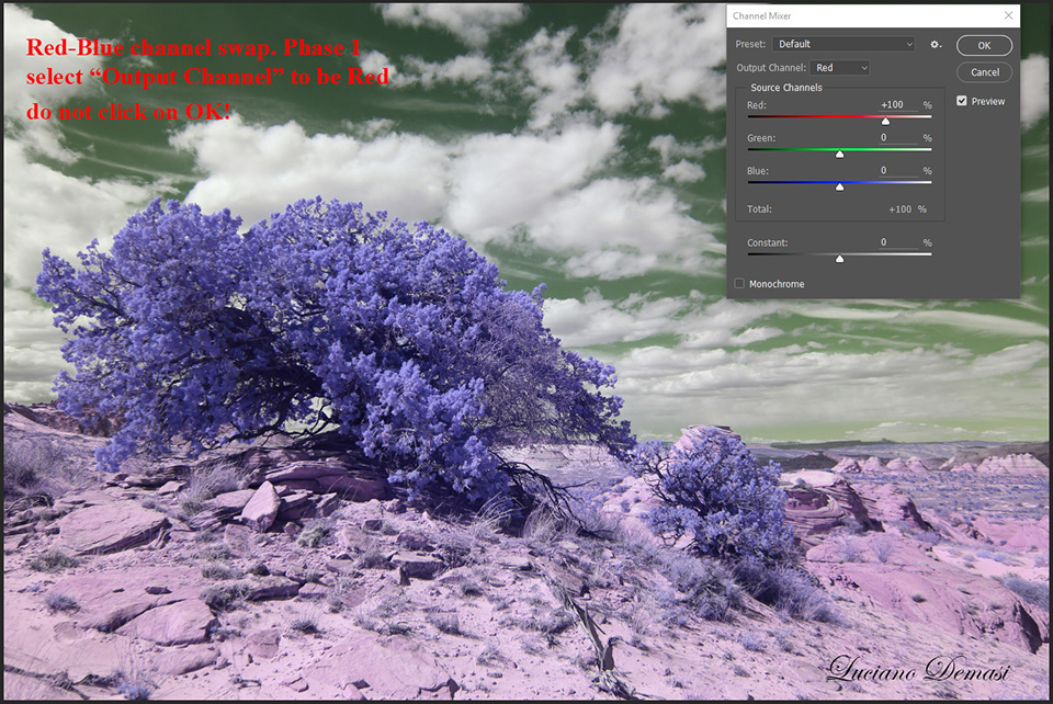
Figure 4: Red-Blue channel swap (Phase 1)
Then without pressing OK, put the number 0 in place of 100 in correspondence of Source Channels-Red, and place 100 instead of 0 in the Source Channels-blue (Figure 5).
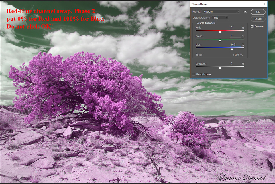
Figure 5: Red-Blue channel swap (Phase 2)
You notice that the image changes color. Without pressing OK, select the “Output Channel” to be blue (Figure 6) and put 0 in correspondence of Source Channels-Blue and 100 in place of Source Channels-Red (Figure 7).
We achieved a very colorful image but the sky is still not blue. Then we can perform another channel swap, this time between Blue and Green.
The procedure is formally identical and is summarized in Figures 8, 9, 10, and 11.
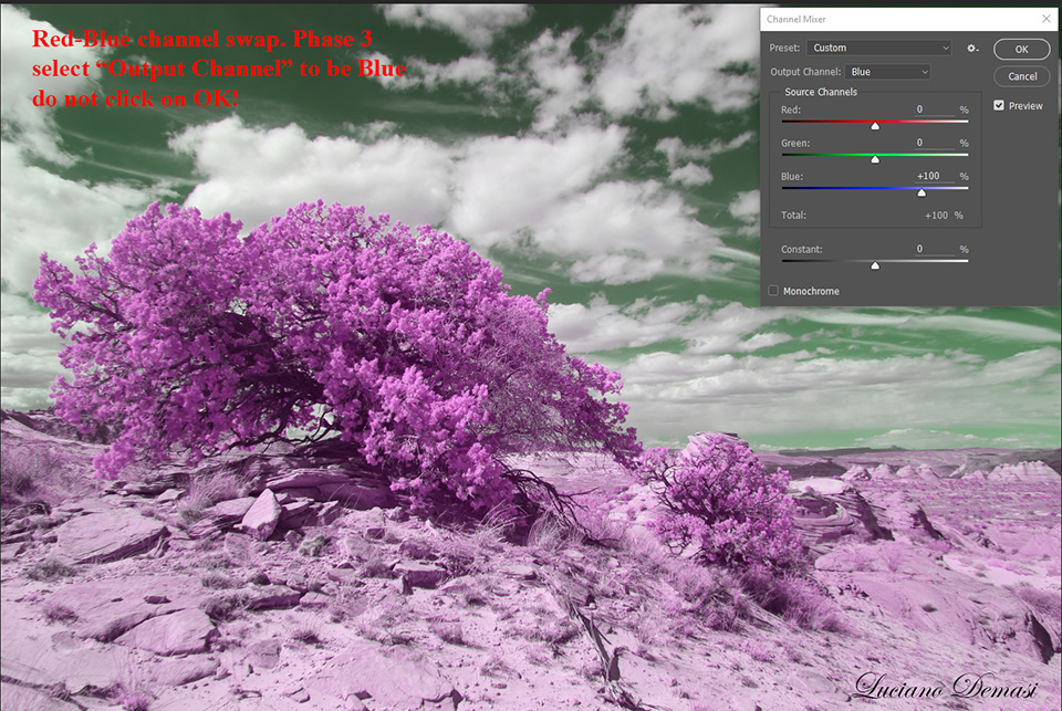
Figure 6: Red-Blue channel swap (Phase 3)
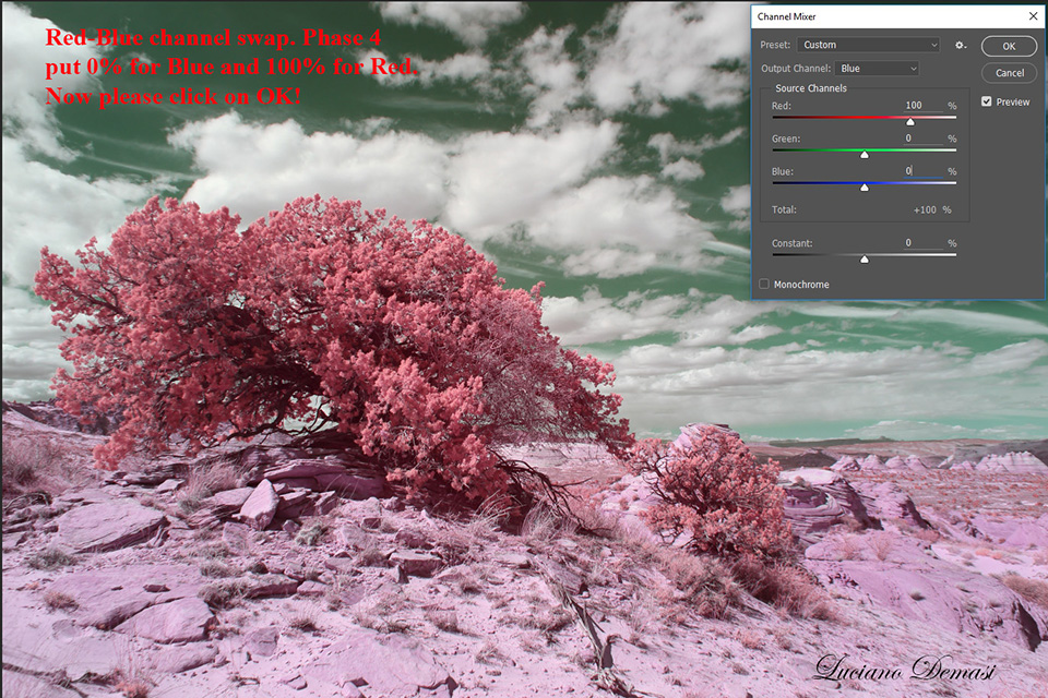
Figure 7: Red-Blue channel swap completed (Phase 4)
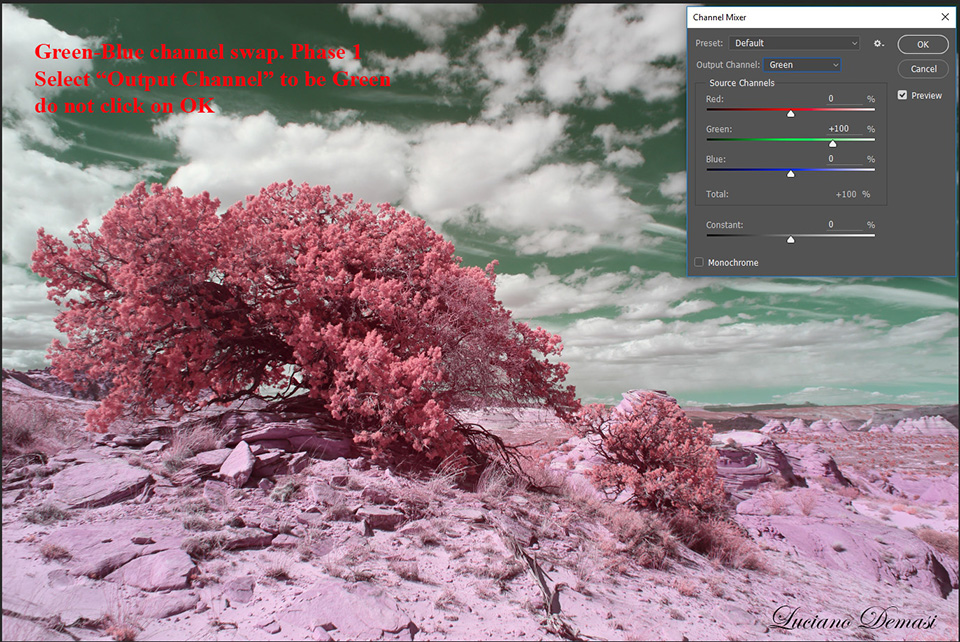
Figure 8: Green-Blue channel swap (Phase 1)
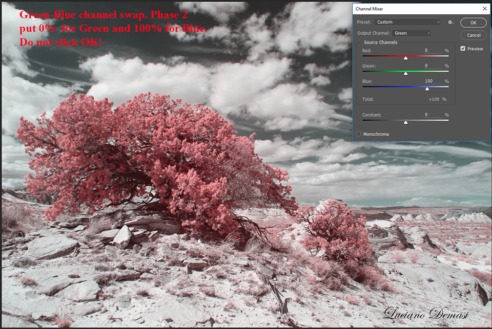
Figure 9: Green-Blue channel swap (Phase 2)
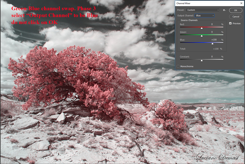
Figure 10: Green-Blue channel swap (Phase 3)
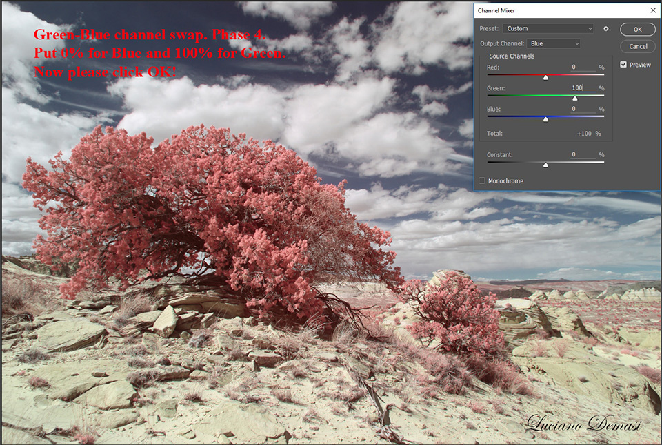
Figure 11: Green-Blue channel swap completed (Phase 4)
Now we have our beautiful blue sky and colorful image. With additional PHOTOSHOP operations on the contrast and saturation you can finally get Figure 1.
After you learn this sequence of operations it is particularly simple to generate images with red vegetation and blue sky.
You also have the possibility to change the colors with an enormous freedom by using the Photoshop sequence “Image-Adjustments-Hue/Saturation…” and then instead of “Master” pick “reds” and change the “Hue”. You can easily get the image of Figure 12 and an incredible variety (see the examples of Figures 13, 14, and 15). It is really not a big deal, as you can see.
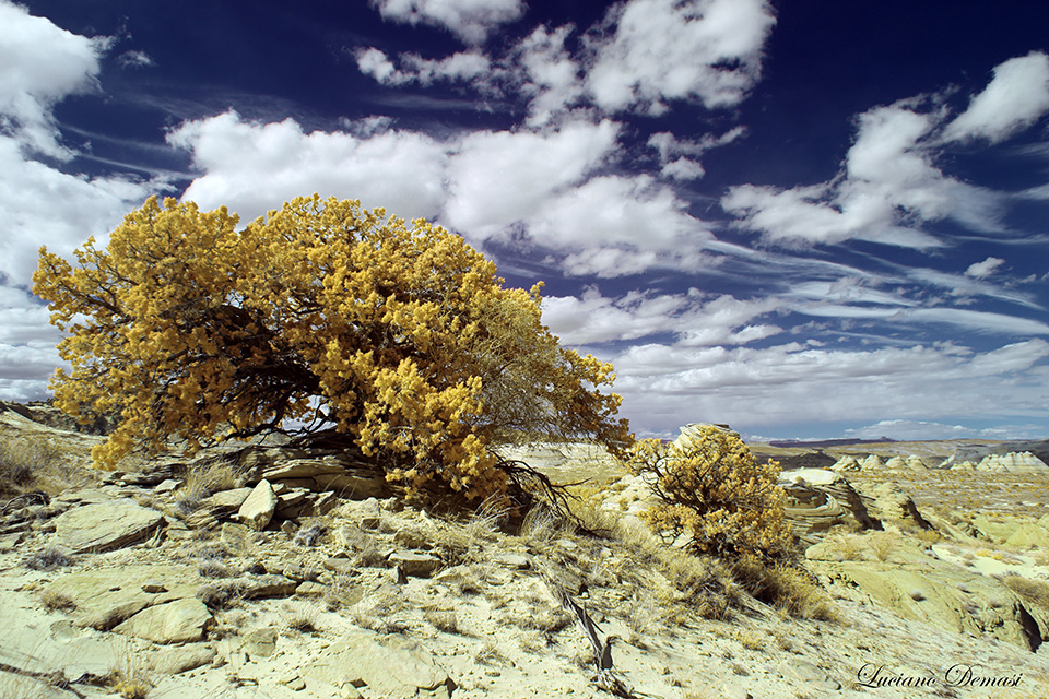
Figure 12: a different postprocessing option with yellow foliage
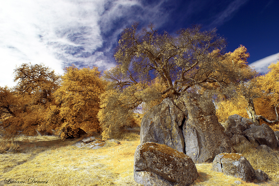
Figure 13: example
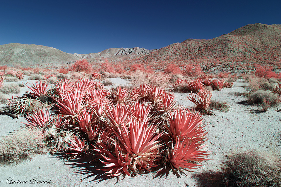
Figure 14: example
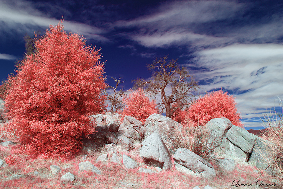
Figure 15: example
You can see more examples of postprocessing in the article on Kolari Vision’s website https://kolarivision.com/post-infrared-photo-editing/processing-550nm-ir-filter/. I also posted some photos with the examples of channel swaps (https://kolarivision.com/infrared-photographer/luciano-demasi/). Recently Bob Vishneski reviewed the 550nm filter (https://photographylife.com/reviews/kolari-vision-550nm-infrared-filter) and has been posting Instagram photos (account name bvishneski) for additional examples on the flexibility of this filter.
WHAT ABOUT BLACK AND WHITE PHOTOGRAPHY?
Simple. Just take for instance the image of Figure 15 and then convert in black and white (“Image-Adjustments-Black & White…”).
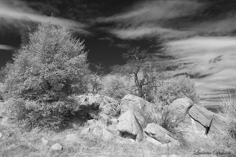
Figure 16: Black and White version of Figure 15 (option1)
But you can do much more! Just take Figure 15 and in PHOTOSHOP, under the menu “Image-Adjustments-Black & White…”, move the bar of Reds to the right (more luminosity). Look at the result in Figures 17 and 18.
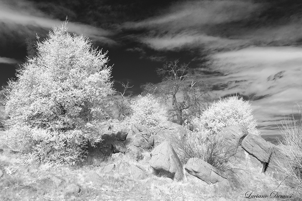
Figure 17: Black and White version of Figure 15 (option2)
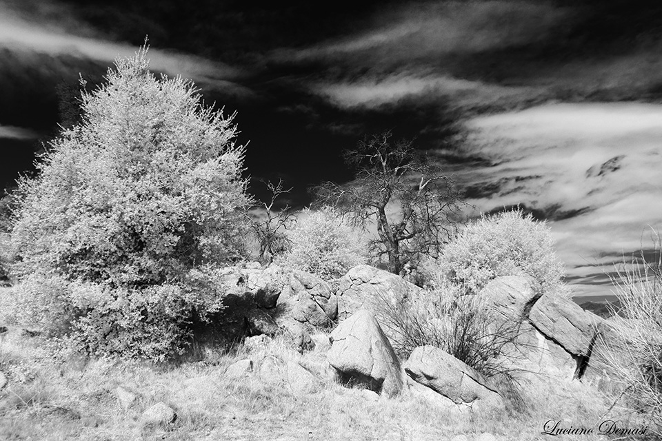
Figure 18: Black and White version of Figure 15 (option3)
CONCLUSIONS
The 550nm Infrared filter has the following properties you should consider:
• It produces images with incredible colors.
• You can easily convert the images to Black and White with high contrast between plants and sky
• It allows more light to hit the camera sensor compared to other filters such as the 720nm. Thus, it allows lower ISO and higher shutter speed. However, the Hypercolor filter receives even more light compared to the 550nm filter
• It is less likely to have a problem with your current lens equipment (hot spot) compared to 720nm or 830nm and 850nm filters
• It has a large versatility similar to the 590nm filter
• To get the blue sky you need to perform 2 channel swaps (or equivalent set of operations). Thus, it is a little more difficult to use for beginners (who do not read this guide…).
Each moment is unique
…nature provides an immense and stunning endless beauty